British design studio's adverts for new Darren Aronofsky film echo Polish and Czech posters of the 60s and ballet advertisements of the early 20th century ? to impressive effect
I'm looking forward to seeing Darren Aronofsky's Black Swan, the ballet thriller that the director views as a companion piece to his last film, the gripping and compassionate drama The Wrestler. But I'm also hoping to see the film's beautiful and striking posters on buses and bus shelters around the country. These are some of the most interesting and arresting movie posters I've seen for a long time.
The adverts were created by the British design studio LaBoca and are influenced by Polish and Czech posters of the 60s and 70s, as well as ballet advertisements of the early 20th century. You can see the full set here. Three of the four take as their starting point some kind of dual or mingled image of Natalie Portman's dancer and the swan of the title. All follow a set colour scheme of black, red and white (or cream), and each uses different, slightly unusual typography that seems integrated into the poster as a whole.
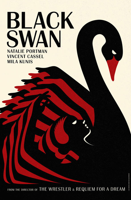
The one above is my favourite (click on the image at the top for the full version), an expressionistic design in which Portman's multiple arms fold over one another in alternating black and red to create the shape of the swan's body, while the swan's neck curves gracefully up from hers. Portman's eye and the swan's eye are identical, and her hairpiece resembles a feather, as well as adding to the 1920s, art deco feel of the overall image.
The second picture (left ? click on each image for the full version) is almost as good. In it, the swan's black head curves around Portman's pale face, its red eye doubling as hers, feathers drifting across the frame in inverted silhouette. The swan's red beak could represent a tear, or a mask worn by Portman as part of her costume, and distantly echoes the famous poster for A Clockwork Orange.
In the third advert (left), the stylised, circular body of the swan functions as a keyhole peeking into a theatre, where the dancer performs in front of a starry backdrop, the stage or lake under her feet casually suggested by incomplete horizontal lines.
The fourth picture (below left) is full of futurist movement and urgency, with the figure of the ballet dancer (here not really resembling Portman) pushing forward into the frame, its masked face almost screaming, its body becoming less realistic and representational until its legs become merely a red triangle.
Scot Bendall was the art director and one of three illustrators working on the project at LaBoca. The underlying concept behind the designs, he said, "was to create artwork that conveyed the feeling of the movie in much the same way that Polish and Czech film posters did so well in the 60s and 70s".
Each poster, Bendall said, "aims to convey the grace and fragility of the White Swan in contrast to the aggression and power of the Black Swan".
He compared designing the posters to creating a record sleeve. "Our hope was to create a set of posters that could accompany the film without explicitly acting as a selling tool. We think a movie poster can help make a connection with the story of a film in much the same way a great record sleeve can do with music. It's ultimately about adding something to the experience."
Interestingly, he said the designers were not able to see the film before producing the posters. "The original brief was to make an attempt at interpreting the essence and feeling of the movie in illustration, with the aim of creating teaser posters that could ignite interest and excitement for the forthcoming release," Bendall said. "Without seeing the film this potentially could've been quite difficult to achieve successfully, but also meant we were afforded a lot of creative freedom to explore and develop ideas."
He said the designers had been "overwhelmed" by the positive response to the images.
Eszter Karpati, an art and design historian and editor at Kraken Opus books, said she liked the posters. "I do like how all four posters use the same elements ? the swan, the dancer, the oval shape, the moon, the lake, the night," she said. "They share the same basic concept of shapes revealing other shapes, image within image; the negative spaces are always suggestive of new figurative elements.
"And all of this seems really relevant to the plot ? the swan having to have two identities at once." (The IMDB notes: "Swan Lake requires a dancer who can play both the White Swan with innocence and grace, and the Black Swan, who represents guile and sensuality. Nina [Portman] fits the White Swan role perfectly but Lily [Mila Kunis] is the personification of the Black Swan.")
Karpati said that, if it weren't for the second poster, she would be tempted to say that they were all posters with "a generic 20s-30s modernist aesthetic ? which would explain the colour scheme of red, white and black." These colours, she added, "when used together ... create an instantly modernist feel and recall the Bauhaus aesthetic and with it their modernist thinking."
But the second poster "just does not seem to fit the bill ? the silhouette and the graduation of the tone in the background, going from black to red and back to black again, framed by that oval shape, and those feathers falling off the page ? it just feels like a much more contemporary image."
She added of the second advert: "This is the darkest image of the four ? it definitely prepares you for some drama. Some feathers will be ruffled ... No 2 is the poster that makes me want to see the film ? now."
Karpati added that she felt the colour scheme of red, white and black tended to be overused in graphic design and typography even today. "Since the late 1910s, due to [its] instant association with modernism, [this combination has] been appropriated consciously, and perhaps unconsciously ? the cover of A Journey [by Tony Blair] ? by any project keen to come across forward-looking and 'modern'."
As Bendall suggests, the use of silhouettes and blocks of colour are reminiscent of those fascinating Polish film posters exhibited at Cin�philia West in London last year ? particularly the ones for Blade Runner, Breakfast at Tiffany's, Raging Bull and Fight Club (the style has endured beyond the 70s). Like the Polish posters, these ones for Black Swan seem almost to come from a different world, one where, instead of moving from the realist-style ensemble paintings of the 80s to embrace photo-realism, as the majority of film posters seem to have done today, advertising and marketing instead went the other way, towards a more expressionistic, symbolist style of artwork, unapologetically non-realistic.
Fox Searchlight has put out a few more conventional posters for Black Swan too, although this one (left), in which everything but Portman's eyes, nose and lips is out of focus, is unusual in its own way too, with its slightly asymmetrical composition and refusal to adhere to conventional Hollywood tropes of beauty and glamour.
I hope Black Swan will be as good as its posters, although needless to say this isn't always the case. I found Sofia Coppola's Somewhere underwhelming, although it undeniably contained some memorable images ?�Stephen Dorff floating on a lilo, his head moving gradually out of shot; Dorff's Ferrari racing around a test track for slightly too long; his head wrapped claustrophobically in a plaster mould ? but I really liked its main poster, which seemed in the same vein as those successful moments, the tiny figures of Dorff and his daughter dwarfed by the palm trees and foliage of LA's Chateau Marmont hotel.
Similar was Inception, which also used some striking images in its billboard adverts, particularly this one, which took as its starting point the film's most memorable scene, in which a city begins to fold in on itself.
But the most impressive element in Inception's campaign, for me, was this enormous trompe l'eoil artwork that was hung from the side of a building in New York City earlier this year (below), showing the wall peeling back to reveal the office furniture and the floors within. Warner Bros, which spent $100m on marketing for the movie, paid for another tailor-made poster on the other side of Manhattan, too, this one featuring waves of water pouring out of the windows down the wall; both were more radical and dreamlike than most of the images in that disappointingly pedestrian film.
Which movie posters have impressed you lately? Let us know below, with links if you can find them.
? Black Swan is released on 21 January
Source: http://www.guardian.co.uk/film/filmblog/2010/dec/20/black-swan-posters
effective advertising interactive advertising print advertising tips web advertising
No comments:
Post a Comment